
Quori: Brand Refresh and Messaging Framework
Quori® had a strong foundational brand but needed sharper positioning. Born from its leadership's background in security and defence, Quori originally described itself as a risk management company. But as it grew, so did its work. It was no longer helping retailers predict crime hotspots; it was helping government teams tackle complex smuggling operations, protect critical infrastructure and predict where sanctioned ships were headed. "Risk" felt too small and too commercial a word to lead with. And in a crowded market of risk management companies, how could Quori show what made it different?
The old language also blurred the line between the company and its product. Quori clung to it like a well-loved jumper with a few moth holes. After some gentle persuasion, we agreed to start again. The result was a clear reintroduction: Quori is a global operational intelligence system (Q-OIS) that delivers decision advantage. This puts the product at the centre, lets us distinguish Quori the company from Q-OIS the product when needed, and states its main benefit plainly.
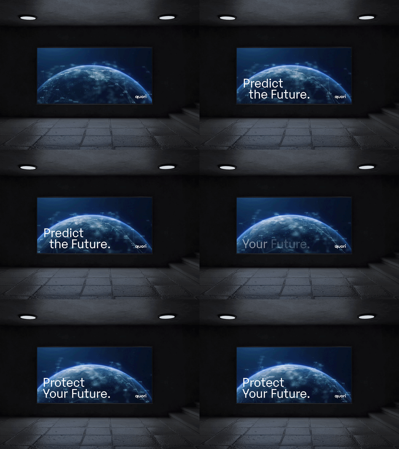
I also built on the original slogan, Predict the Future. It captured Quori's predictive analytics well, but could have belonged to any analytics firm. Adding a second line kept the brand equity they'd built while speaking directly to their new audience of government and security agencies tackling the world's hardest security challenges: Predict the Future. Protect Your Future.
Expanding the Quori brand
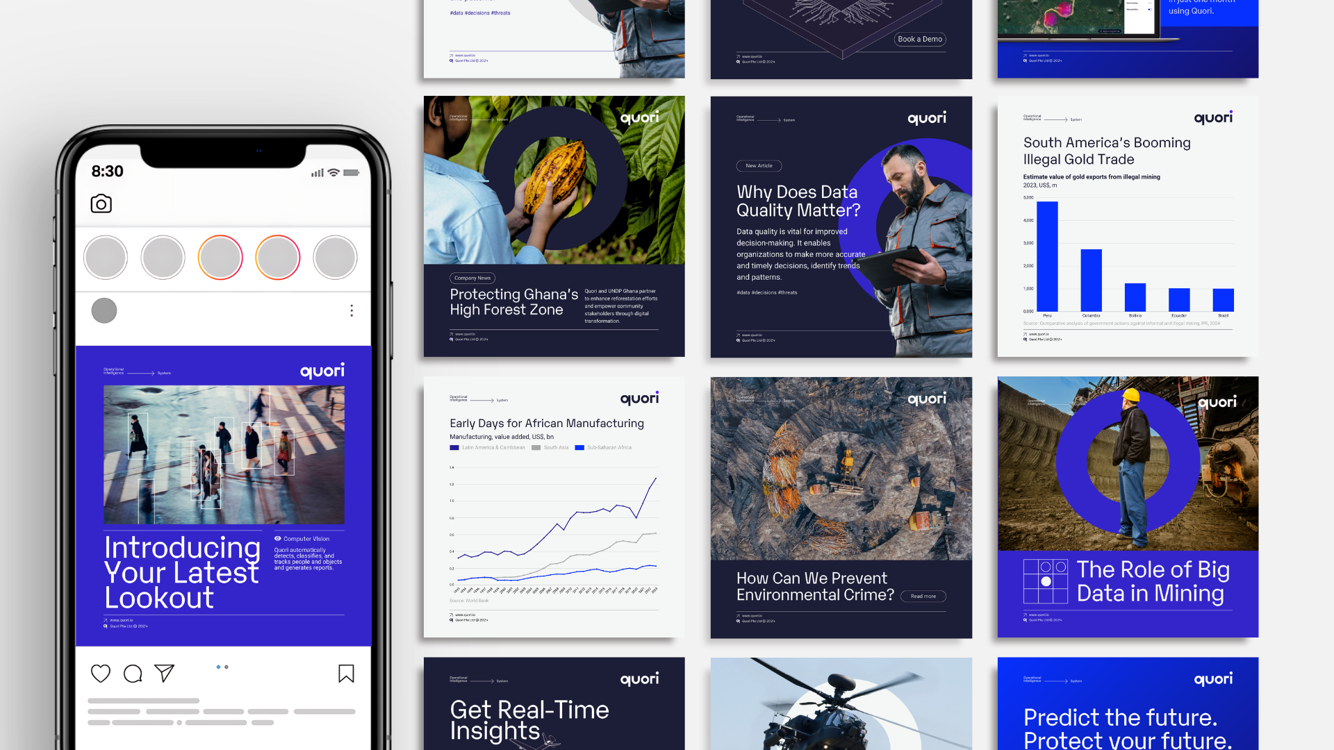
Following the messaging, the visual identity also needed to expand. The team had no social media presence, no templates, and few marketing materials. Starting from scratch, I built a design system and an extensive range of templates in Canva, so they could edit pitch deck and reports when they needed them.
For larger materials, we defaulted to a dark mode and paired back the use of electric blue, which felt more like a tech-start up than a trusted partner to government and security agencies.
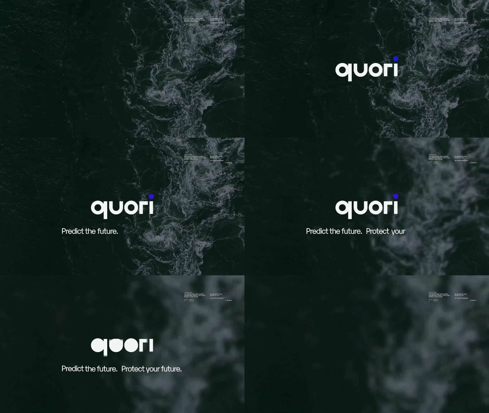
I also led Quori's video production and created an animated logo outro. As their wordmark is constructed from simple geometric forms (beautifully designed by Bohdan Harbaruk) I animated it from a single point: a dot that expands, divides and resolves before reversing. The idea was to show how Quori distills vast amounts of data into one clear point of view, as well as how it can “see” both forwards and backwards in time.